How to make a farewell primary school magazine easier, more fun and more beautiful?
Using Jilster to make a farewell magazine is a matter of starting, formatting and ordering. It is so easy, and by doing this you will get to the point where it is ready. However, it can also lead to extra questions if you want to make it even easier, more fun and more beautiful. That's what this one page is for. It's a collection of all the useful information that will help you and other parents, teachers and students.
First some practical tips to get you started
Use photos with sufficient resolution
When formatting the pages, make sure you use photos that are sharp enough. Otherwise, keep them small so that they remain beautiful. To display photos in a large format, use photos with a higher resolution. If a photo becomes too blurry, the programme will report it.
Use the margin and cropping lines on the canvas
Stay within the margin lines when formatting. This keeps you away from the outer cutting line. If you place your photos over the cutting line, do so generously enough (about 1 cm for safety). Do the same for the cover.
Work together with other parents or pupils
Invite other parents or pupils to join in by sharing pages. You can share a single or multiple pages with someone else so that they can all see and format those pages.
Use templates and old pages for content
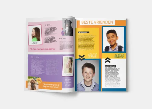
Want to know what you can put in the magazine? Use the template pages for that. They already provide many suggestions. You can also reuse pages from your own magazines from previous school years as templates via the My Pages section in the programme.
Then the tips to make it even easier
Make a core group as the main editors
Organise it nicely. Select a few parents to act as a core group for the whole thing and divide some of the main tasks, such as initial set-up, content and final editing.
Invite other parents with pre-made pages
You can share one or more pages with other parents. Two next to each other (a spread) is best. They will only see those pages. You can share a white canvas, or you can have a pre-made style ready before you invite them as an editor.
Save a structure in the build-up
A magazine often has certain types of pages that serve as fixed 'building blocks'. Like a cover, an editorial, content, etc. The templates show this as well.
Select a style, colour palette and fonts
Make choices in advance that have a major impact on the look and feel. Choose a palette of colours that recur regularly. Choose a font and combination of fonts for the titles and texts.
Think from spreads
When children, teachers and parents enjoy the magazine, they always open a whole two pages side by side. We call this spreads. Keep this in mind when formatting for an even more beautiful look.
Tips for an even more beautiful Farewell primary school magazine
If you want, you can design all separate magazines and order them as one print run. You can also choose that every student has his or her own cover. These variations are all possible in one print run and order. Please contact our Service.
If you have several moments of different creations in the school months, you can add them all together as one print run. This will increase the print run discount by steps, thus reducing the cost per piece.
Payment is easy via the webshop in the makerspace. Sometimes it is easier to pay by invoice. In that case, please send a message to our Service.
Orders for Farewell primary school magazines are usually made at the same time. If you want to exclude any risk of delay, we recommend ordering two weeks in advance. Although we normally only need one to two production days.
Some documents that will make you a top editor
- Yearbook e-book with lots of useful information and more
- Complete checklist for the pro-to-be
- Steps for a Farewell primary school magazine
- Search the Tips & Tricks for even more supporting information


