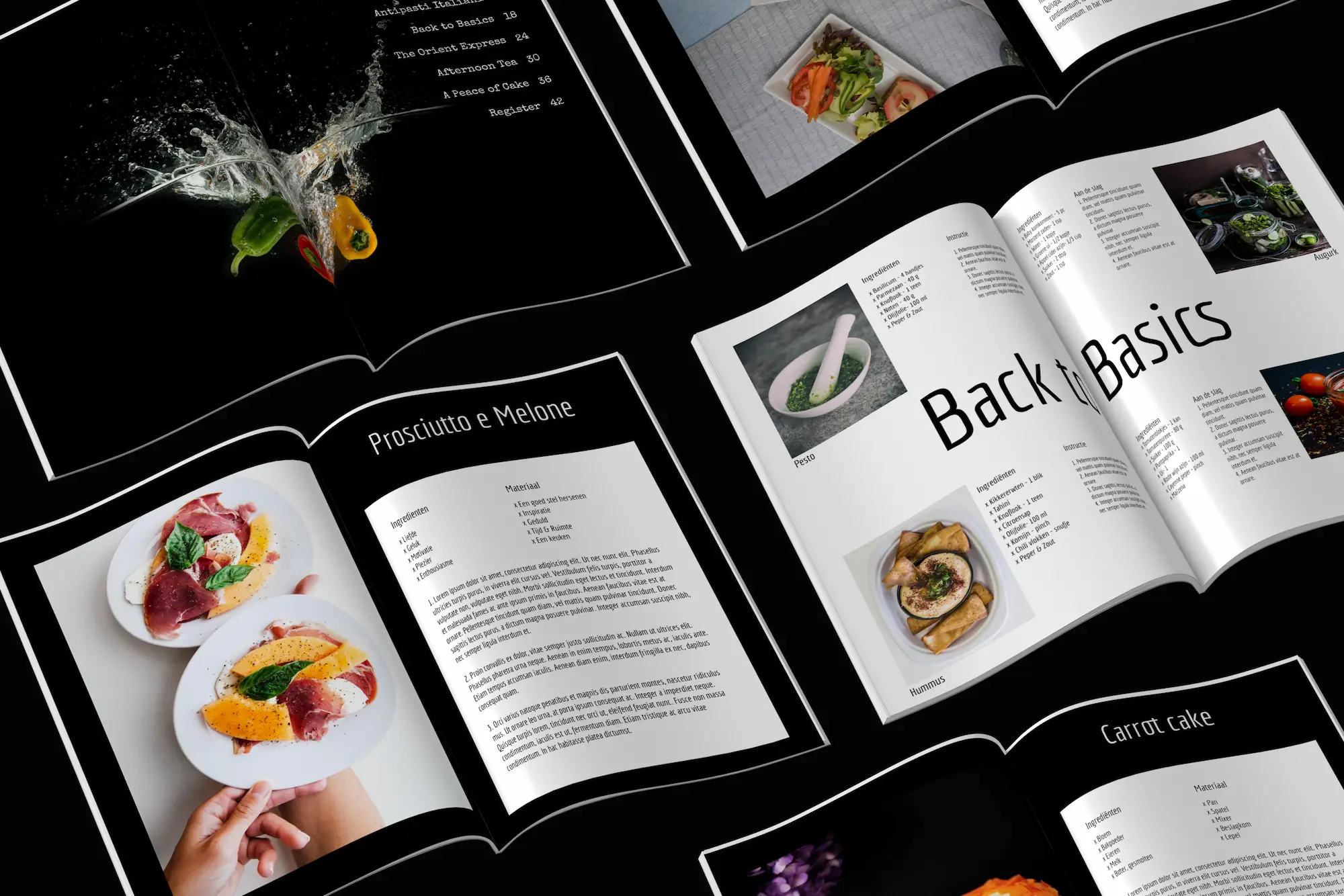
Every magazine has its own feel, its own fonts, its own colour scheme and its own page rhythm. Read how you can make the page layout of your own magazine just as beautiful as that of the professional magazines you can buy in the shops. Here are 6 tips:
Tip 1. Browse your favourite magazine
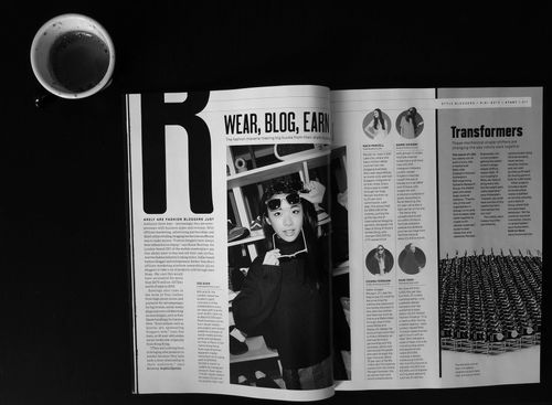
Flip through your favourite magazine and see how the layout works. Recreate a page. You will notice, for instance, how large the letters of a headline are printed in the magazine.
Also take a look at how many different parts a page in a professional magazine contains. There are quite a lot of them. But that is exactly what gives a page its vibrant character.
Tip 2. Choose one style
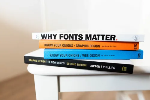
- It is nice to choose one to three fonts that you use throughout the magazine. That gives structure and is more appealing.
- Make sure the longer texts are easy to read. Use columns, regularly place a blank line with a headline above the text, and choose an easily readable font such as Arial or Helvetica in a reasonable font size.
- If you are unsure about the legibility and the font size, you can make a proof print of your page. This is in screen quality, but still gives you a good impression. You can also order a proof copy at a reduced price.
- Use a limited number of colours, which are not too bright.
- Adjust the use of colour to the colours you see in the photo.
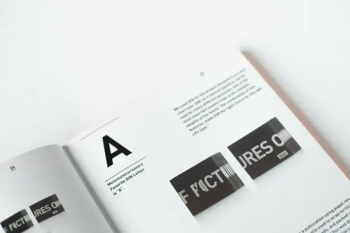
- Make sure the photo and text fit together well. Sometimes you can place the text in such a way that the design has extra meaning. For example, by literally stacking the letters from the word 'Stack' on the page.
Tip 3. Dare to use space
Use a lot of white! In other words, don't fill the whole page.
Sometimes choose to devote a whole page to a headline, a quotation or a photo.
Tip 4. The magic word: variation
Variety is very important in a magazine. Alternate long and short articles, but also long and short texts, large and small photos, one or more photos on a double page.
Visual material: Use a picture that is very good extremely large on the page and a moderate quality picture small. Make more rigorous choices here than you might at first.
Format the different parts of the text differently, overlap photos large and small, and let the letters partly run over the images.
Tip 5. Make a whole out of it
Make the cover, the colophon and the table of contents at the end.
Structure the magazine by repeating texts from the cover in slightly different words in the table of contents and above the article. In this way, the reader of the magazine discovers a clear route through the magazine.
Tip 6. Pay attention to the cover
The cover is the business card of the magazine. Pay a lot of attention to it.
Read the tips on how to make an even better cover.


