When you start creating your own magazine, it is important to think about what colours you want to use. Each colour can influence your readers in a certain way. It is useful to choose colours that fit the subject of your magazine and that are in line with what kind of feeling you want to give your reader.
Colour perception
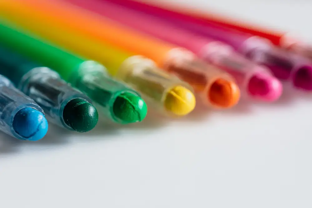
Colours have a strong effect on people and can evoke an emotion. The meaning and effect of colour is very personal, but there are also similarities in the experience of colour. Colours can have both a positive and a negative effect on people. For example, red can be associated with love, passion and romance, but also with anger, pain and danger.
Colour combinations
First of all, think about the message you want to bring across with your page, for whom it is intended, and what you want your page to convey. If you want your magazine to make a strong impression, you can choose colours that are opposite to each other in the colour circle. For example, you can think of colour combinations with yellow and purple, red and green, or blue and orange. If you want to create a calming effect, it is better to choose colours that are close together, such as green and blue or orange and yellow. For more information on the use of colour, go to Johannes Itten's colour wheel.
Background colour
When you want to design your page, you can choose a background colour. White or black is usually suitable as a background colour, but a soft colour can also be nice. You can think of pastel colours, such as soft pink or light blue.
Do you see a colour that recurs in your images? Then chances are that this colour is also suitable for the rest of the layout of your page. You can also look for a more subtle colour in your images. This will prevent the use of colour from becoming too bold and will bring the use of colour on the page into balance. When you decide to combine colour with text, for example in the form of a background or in the text layout, it is important to take the readability of the text into account. It is therefore important to ensure strong contrasts between text and background. Try to avoid texts on a busy background. In the example, you can see that one of the text columns has been made green.
The context
Ultimately, the context in which you want to use the colour will be crucial in how you experience it. For a wedding present, for example, red or pink quickly come to mind, but blue may be more appropriate for a business magazine. Colour strength also matters. The lighter the colour, the softer the effect. The makerspace has been set up in such a way that there are plenty of opportunities to experiment with colours and colour combinations.