Navigate to,
- Tip 1: Form follows function
- Tip 2: Be consistent
- Tip 3: The eye needs rest
- Tip 4: Think about the reader
- Tip 5: Repetition is pleasing to the eye
- Tip 6: Use colors wisely
- Tip 7: Photos need space
- Tip 8: Exciting design lives from contrasts
- Tip 9: Good design takes time
- Tip 10: Surprise me
To give your magazine its own beautiful touch, you can design your own layout. Our tips will make it a breeze. When it comes to the layout of your own magazine - whether it's a wedding magazine, birthday magazine, business magazine, catalog, farewell magazine or graduation magazine - it's not just about what you personally find beautiful, but also about other things. We have put together the 10 most important tips for you:
Tip 1: Form follows function
First consider what function a text has for the magazine page, then determine the appearance. For example, a headline should be eye-catching and easy to read. You should keep this in mind when choosing font color and type.
Tip 2: Be consistent
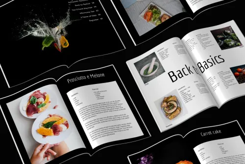
Even if you find many colors and fonts beautiful. All mixed up on one page and even in a magazine do not look nice. So decide on one color scheme or two contrasting colors and one style. Be consistent and stay true to it!
Tip 3: The eye needs rest
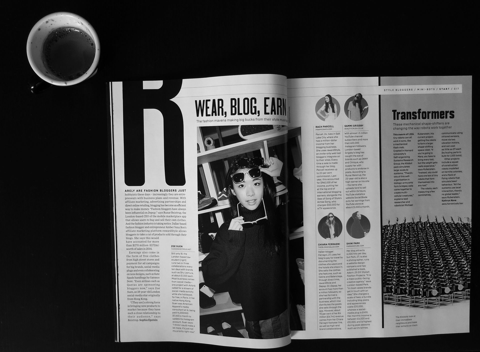
Even empty spaces have their purpose. Fill the pages only so that the eye still has room to rest when looking at them. This way, your texts and images will attract more attention!
Tip 4: Think about the reader
You know your texts well, but your readers don't yet. Make it easier for them to read by choosing legible fonts in a good size that make reading happen by itself. Make sure there is good contrast between background and font color, and enough tranquility. Therefore, avoid competing bright colors.
Tip 5: Repetition is pleasing to the eye
You've decided on a certain page layout for a reportage or a photo page? - Then stick to it. Design all pages of a magazine that have the same category in the same way. Your readers will thank you. It's not boring!
Tip 6: Use colors wisely
Colors are beautiful and colors are important for your layout. Use them wisely. Colors can highlight or provide a frame. Don't overwhelm the eye by choosing too many colors or colors that are too stressful, such as lots of bright neon colors.
Tip 7: Photos need space
Make sure to give photos enough space. They are not just pretty accessories. Readers should be able to recognize the photos at first glance. Therefore, the photos should be large enough. Also leave some space around them, like a passe-partout in a frame. The photos will look better.
Tip 8: Exciting design lives from contrasts
Play with contrasts! For example, choose a very plain background and a restrained font for the body text and make the headlines all the more colorful and with fancy typography.
Tip 9: Good design takes time
Plan enough time to design your layout. It takes time. Plan a buffer that you use to not look at your design for a few days. After this time you will look at your layout with different eyes and a healthy distance. Often it becomes clear what needs to be changed or which elements are perhaps not ideal.
Tip 10: Surprise me
Sometimes it's nice to surprise your readers. To do this, you can break the nine rules above, for example, by designing a double-page spread that is particularly important to you in a completely different style or by making one photo much larger than all the others in this issue. Surprise your readers with your ideas!
Does designing your own layout take too long? Then check out the ready-made magazine templates in the makerspace. There you will find templates for every occasion that you can adapt to your taste.


