The most important page of a magazine is the cover. But how do you make sure your cover looks like one of those amazing covers in the shops, theaters or cinemas? Here are 5 tips for a professional cover:
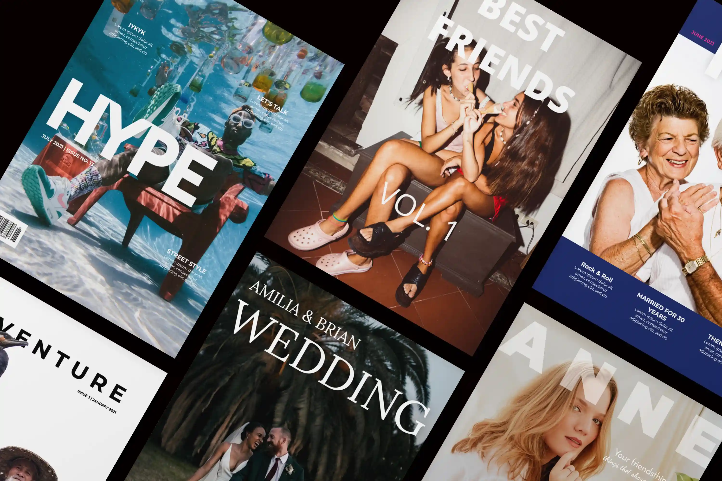
Tip 1: Do something fun with the title of your magazine
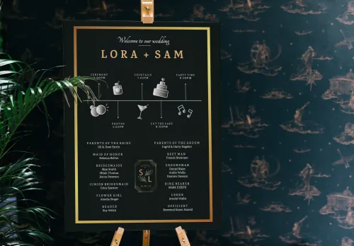
Every magazine has a 'name': a powerful title that says something about the contents of the magazine. To make the title stand out more, use a font with more body. A solid font has more effect than a thin, graceful one. For a birthday-magazine, you can use the name of the birthday boy or girl as the magazine title. You can also use a title that is very recognisable for the birthday boy or girl.
Does your title consist of more than one word? Experiment with different fonts. This can give a nice effect. If you are bound to have a less interesting title, you can still achieve a playful effect with different font types and sizes.
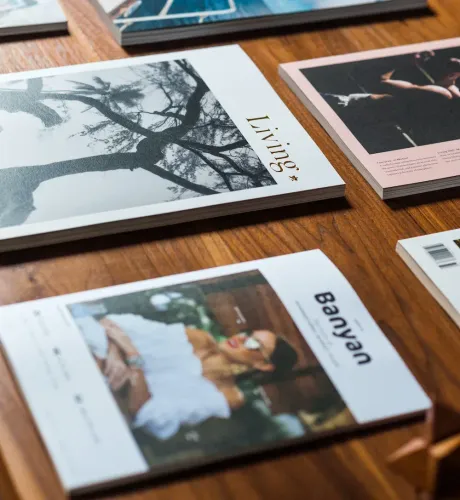
Tip 2: Choose a high-quality and appealing photo or illustration
A good cover consists of 70% image and 30% text.
It is therefore important that your image or illustration can be placed in a large size and that it stands out, so that it is a real eye-catcher. Avoid images with a busy background, images with many people on them or complicated images. This is especially important if you are having your cover printed as a poster.
Tip 3: Place so-called teasers
A teaser on your cover briefly indicates what the reader can expect in the magazine. You make people curious. Place several teasers on the cover, on various subjects. This way there is always a subject that appeals to every reader. Make the text on your cover short and sweet.
Tip 4: Play with the typography
For example, use different font sizes, between minimum two and maximum four. Combine upper and lower case letters to create variation and add eye-catching colours here and there next to the basic colour.
When you are almost finished, check whether all the texts are clearly legible against the background of the photo. Make sure there is enough contrast between the background and the text.
Tip 5: Look at covers in shops, theaters or cinemas and get inspired
You can learn a lot from professionally made covers. Take a look at the layout, typography and use of colour, for example. There is also a lot to discover on Pinterest. Jilster has its own boards there with many visitors and interested parties.
Extra tip: Have a poster printed of your cover.
Hopefully these tips will help you design a personal and professional magazine cover.