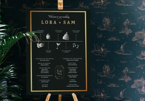
Opinions are divided on funny content in the wedding magazine. Some think it's great - others think it's terrible. We think it all depends on what you make of it. We want to show you this with the example of the marriage law. Our tip in advance: Match the marriage law or other funny content to the style of the wedding magazine. Nothing is worse than a page where it is clear at first glance that you had to think of something quickly when you were pressed for time, but you didn't really feel like it. Of course, a marriage bill is an ideal stopgap. The trick, however, is that they shouldn't look like it. Here's how you do it:
Write a marriage law
You can find many suggestions for marriage laws on the internet. But when you find one you like, you should ask yourself the following questions:
- Does the writing style fit with the other texts in the wedding magazine?
- Does the message fit the flair of the magazine?
- What do I mean by that?
If you want to make fun of the bride and groom, their family and guests in the wedding magazine, then a funny marriage law is a good choice. Of course, you can also write the marriage law yourself and pick up on the individual characteristics of the bride and groom. Does the bride wear the trousers in the relationship? Then this saying is really appropriate:
§ 1 Kathrin is always right.
§ 2 If Kathrin is not right, § 1 comes into force immediately.
The design
You should also orientate the visual design of the marriage laws on the style of your wedding magazine. In short, it is advisable to create a uniform style for your magazine with the right choice of colours, the appropriate fonts and a few decorative elements. For the example above, we have adapted one of our wedding magazine templates to keep the beautiful style of the template. By the way, it is very easy to adapt the templates to your wishes. With just a few clicks, you've changed the colour scheme and fonts to create a style all your own. Marriage laws can be a great addition to the wedding magazine - if you adapt them to the style of the magazine. They should match the rest of the magazine both in terms of writing style and visual appearance - then they won't stand out at all as gap fillers.


