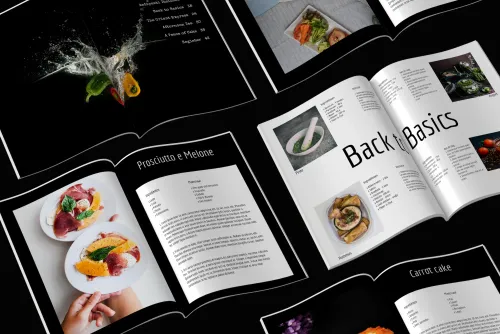
The table of contents is the heart of a magazine. Here, your readers get an overview of the topics and can search for specific articles that they may have been particularly curious about due to the headline on the cover. A well-structured table of contents is also helpful for yourself: Here you can see all your articles and pages again at a glance and in the order in which you created them.
The time to create the table of contents
The best time to compile a table of contents is when the magazine itself is finished and all the articles are written. Otherwise, you will have to revise and update it every time articles are added. You'll be doing more work than necessary.
The content
As the name suggests, the table of contents contains the contents of your magazine. Therefore, it should clearly contain all articles that are in your magazine. First of all, it makes sense to write down the headings of your articles in the order in which they appear in your magazine. Don't forget to include headings like the masthead. Now you have the basis. From this you can now create your own table of contents.
The style
There are also different ways to design a table of contents. For inspiration, browse through the magazines you have at home and click through the templates in makerspace. You can also take a look at the tables of contents of the magazines in the supermarket to get some ideas. Basically, the table of contents should match the layout of your birthday magazine, wedding magazine or graduation magazine. This means that you should use the same design elements here, such as colors and fonts.
The design options
Decide on a style for the headings in your table of contents. For example, you can simply list them in the order in which the articles appear in the magazine, with the page numbers behind them, using only one font. This is the simplest option. Another idea is to highlight in color all the articles that you have already teased on the cover of the self-designed magazine. Ideally, use only colors that can be found on the cover and in the rest of the magazine. This way, your readers will be able to quickly find the articles they already found exciting on the cover. Alternatively, or in addition, you can insert photos that refer to the content of the articles. This makes the table of contents more diverse and colorful and gives your readers a taste of the content. A nice idea is to use cutouts of the photos that are in the respective article. To make it look less static, you can show the photos in different sizes, sometimes before and sometimes after the text, or simply add page numbers in the middle of the double page that refer to the appropriate articles. In order to keep the table of contents page from becoming too full, you should not show a photo for every article. If you have only a few articles in the magazine, it is not a problem. Just decide from your gut how it looks best. You can also sort the headlines of a very large magazine by topic, e.g. recipes, sports, profiles. This makes it easier for readers to find their way around and everything is better structured. However, this is only worthwhile if you can compile at least two to three articles in each rubric.
The order
When you have finished designing your table of contents, you can see all the contents of your magazine at a glance in the order in which they will be printed in the magazine. This is a good moment to take another look and let everything sink in: Are the articles in the best possible order? Or do you still want to change something? Now is exactly the right time to rethink and possibly change things.


